You plan on opening an ice cream shop. Or you own a pizzeria with menu boards that your customers can’t read easily. Or your deli has tired wall menus from the meat provider that have seen better days…
How to get good menu boards that will sell food well is a bit daunting. There are so many decisions to be made. WHERE to get restaurant menu boards cheap? Should you get chalkboard menus, hand-written menu boards, do a stock menu board template, go the digital menu board route, or find custom designed and printed menu boards?
This much we know:
You DON’T want them to look cheap. You DON’T want them to be crowded and hard to read. You DON’T want a typical look like every other business in town. You DON’T want your shop to be boring and forgettable.Your Intuition
You DO want them to be unique, easy to read, cleanable, changeable and easy to install…AND to increase sales!
There is a lot of design psychology that goes into a well designed menu board. Color theory, item placement, image sizes, and best price display must all be understood and used to their full potential. This is called menu engineering in ‘the business’.
Creatively designed menu boards will entice and intrigue your customers.
Your menu boards must create a positive first impression. A strong Halo Effect is created the more elements that your business does properly. In business, the halo effect refers to the positive effect that one good impression has on the rest of a person’s opinion of a business. You want your business to say “DELICIOUS”, “FRESH”, “UNIQUE”, “QUALITY”, and your menu boards can psychologically prime customers to feel that and add to the halo. Shop windows, interior color, lighting, cleanliness etc. should also be used strategically to enhance your customers’ experience.
A few important principles of menu design:
Simplicity is best. Do not overcrowd your wall menus with too much information as it overwhelms customers and slows down the decision-making process. This is yet another time when ‘less is more’. Selective item choice and descriptions is vital. We often suggest that our customers make a notation to ‘see paper menu for more detail’. We can work with you to fine tune your menu showing based on our nearly 30 years experience. Item Placement is important. Studies have shown that it’s optimum to place your most expensive menu items on the top right of the menu. Your best sellers go on the top left. Lowest popularity or lowest profit items to the bottom left. Popular, but not as profitable items are best on the bottom right.
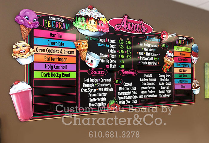
Images. Images on your menu boards have a dramatic effect on sales. They can be used to strategically draw the eye around the menu and highlight items for increased sales. Colorful images, especially hand painted images as we create at Character&Co. add that artisanal and unique element not found in mass produced menus. If you have particular menu items that you want to promote, we can custom paint them the way you make them. Our art work is applied as layers for added dimension and even more visual interest. Nothing generic about our style of menu boards!
Categories. Segment your menu into categories; different menu boards for each major category. For example, most delis that we’ve worked with will have a Deli Meats & Cheese Board; a Specialty Sandwich Board; and a Soups & Salads Board. Ice Cream shops will categorize their menus into an Ice Cream Flavors Board; a Cups & Cones Board; a Shakes & Smoothies Board; and a Specialty Sundaes Menu Board. Of course, these are typical, but not mandatory.
Menu Placement & Order. People tend to spend the most time looking in the direction of the cash register so the menu board with your highest profit items should closest to that area. The font used for your menus must be legible from a distance so that when the line is longer, people can read the menu boards easily. You definitely want to avoid hearing your customers mutter that they can”t even read the menus…
Color. A color scheme that coordinates with your interior design is critical. Your menu boards should function practically, profitably AND as major aesthetic design elements in your restaurant decor. Menu boards with strong color contrast draw the most attention and are easiest to read. Use white against black for the most artistic POP and highest visibility. Item descriptions can be in accent colors and a slightly smaller font. Highlight specialty items with outlines and or illustrations to draw more attention.
Prices. It is psychologically advantageous to tack the price to the end of each menu item line because it subliminally de-emphasizes the cost. This may be beneficial in that way BUT when changing prices later, we have found that having your item prices lined up in a neat column is better for you. Character&Co. offers price change options as either individual numbers or complete columns. The latter option is much easier for the business owner. See examples HERE.
Do not include $ signs on the prices and be aware that ending prices with 0’s and 5’s (ie 4.95, 3.00, 6.75) has the psychological effect of communicating “friendliness “, whilst numbers ending in 9’s (ie 4.99, 3.59, 6.79) suggest value. Whichever way you choose to feature your prices, make the technique consistent throughout your menus.